We Will, We Will Rock UI
It’s finally here! Our new User Interface will be gracing your screens in the week commencing 24th September 2018! Hooray, we hear you cry!
Support Videos
The Customer Support team have been very busy putting together some introductory videos to the UI upgrade, which we hope will smooth the transition from old to new. Alice, our Customer Support Team Leader, has uploaded them to a YouTube channel here, and they will be available on your menu bar whenever you are logged in to SARD, to the left of your user photo.
FAQs
Change can be tough, and we know it can be daunting to log on to a system which looks completely different, so we’ve compiled a few FAQs below:
Do I need to do anything?
Nope! If we upgrade while you are using the system you may need to ‘hard refresh’ your browser but we will aim to do this outside of working hours, so it shouldn’t affect too many of you. Apart from familiarising yourself with the new look, you’ll be ready to get straight back to those appraisals or job plans straightaway!
How different will it be?
While the look of SARD is quite different, we took particular effort to keep the functionality the same. Whilst developing, we merged any changes from our current site each morning, so all buttons should be exactly where you left them. The only big deviation from this are our navigation menus, but we think you’ll love how they’ve improved (see below for more on menus).
How can I prepare?
Well first, read our previous two blogs on the UI upgrade – SARD’s new User Interface and Knowing Me, Knowing UI. There is plenty of info to help you and the odd screenshot to whet your whistles. Secondly, you can watch our super helpful Support Videos!
Will it be optimised for mobile?
Yes, it will be far better suited for mobile and tablet viewing, and currently looks wonderful on either! However, SARD is a large system whose modules mostly require a lot of typing, selecting checkboxes, radio buttons and dropdown menus, and as such will always work best on a desktop or tablet. That’s just the way the cookie crumbles!
Menus
The biggest change, as mentioned above, is the navigation around SARD. We have grouped the menus according to our modules, so you should find everything needed for Revalidation under the Appraisal tab, everything for Job Planning under Job Planning, etc. This is a far more compact and therefore neater view for happier SARD-surfing. Tidy room, tidy mind!

Where are my Dashboards and Reports?
Menu items are stored under logical and space-saving dropdown menus. Reports are under the ‘Reports’ tab (should you have any!), and Dashboards (including RO and Appraiser) are under the ‘Dashboard’ tab. If you only have the one, original dashboard, then it will be a button as normal.

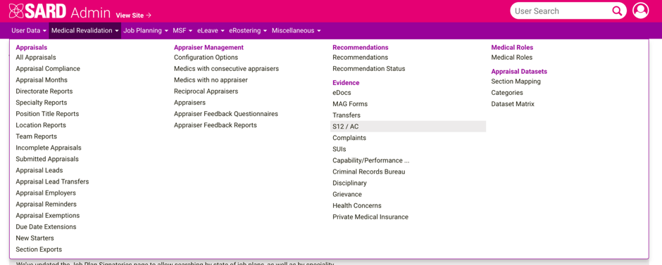
The ‘Admin’ tab takes you to the admin side as usual, though it now sits on the right instead of the left. The Admin menu is different again, as we now have the mega-awesome mega-menu! Again, everything is grouped together, and each tab has its own sub-sections which you will no doubt be familiar with in no time.

Good luck and have fun! 5 weeks to go!


