New Look Dashboard, Appraisal and Job Plan Forms
On Monday 30th September 2024, we will be deploying changes to the User Dashboard (My Dashboard), Appraisal and Job Plan Forms. Please read on to see what exciting new features have been created, and how to utilise these.
Introducing the New SARD Dashboard Upgrade: Your Enhanced Navigation and Action Hub
We are thrilled to announce a significant upgrade to your SARD experience—an all-new dashboard designed with you in mind. This latest update not only enhances your navigation capabilities but also provides a more comprehensive overview of the actions required to keep your account in top shape.
What’s New?
- Improved Navigation:
- We’ve streamlined the layout to make it easier than ever to find what you need. Whether you’re updating your appraisal, job plan or MSF, reviewing reports, or accessing support, everything is now just a click away.
- Dashboard Overview:
- Stay on top of your account with our new Dashboard Overview! This feature consolidates all pending tasks across all our products in one place, giving you a clear view of what needs your attention.
How This Came About:
We know how important it is for you to manage your account efficiently. With these upgrades, you’ll save time navigating through menus and tracking down tasks. The new dashboard ensures that you’re always informed and empowered to take action when needed, keeping your account running smoothly with minimal effort.
Ready to Explore?
Log in to your SARD account today and see the new dashboard for yourself! We’re confident that this upgrade will enhance your experience across the SARD application.
As always, we value your feedback. Feel free to reach out to our support team if you have any questions or need assistance navigating the new dashboard. We’re here to help!
Overview
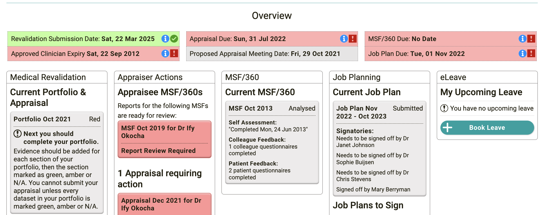
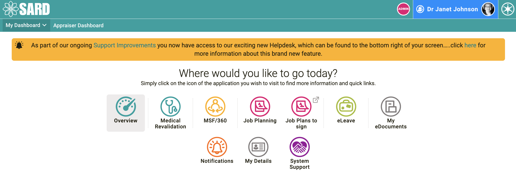
The overview is the first thing you see when you view your dashboard. It is a comprehensive view of everything you need to know and highlights things that require your attention. All your due dates are listed there, plus the status of any open Appraisals / MSF/360 / Job Plans, plus eLeave requests/ Job Plans to sign, and Appraiser actions.

Messages from your organisation will now pop up when you access your dashboard. This is where you will find the contents which used to sit at the top of a user’s dashboard. The popup can be easily closed, but we intend on turning the popup aspect of it off in a few months time.

SARD administrators: We recommend these contents are checked through and either added as single pages (a page each user must click to confirm they have read) or as contents specific elsewhere (many are about appraisals; we now have an appraisal info section on the appraisal form which can contain ‘Messages from your Organisation’). Our goal and yours is for the popup to be on first login only and referred back to by users when necessary.
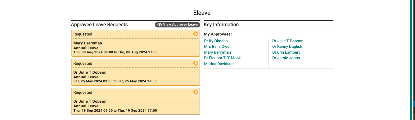
Buttons to approve leave have been removed from the dashboard so the approver must check the leave request fully before accepting. This can be accessed via the eLeave application as shown above.
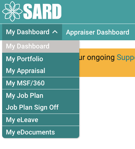
My Dashboard is now a drop-down menu, which will take you to your specific products, and the different dashboards based on your roles now appears across the top bar (e.g. Appraiser/RO/ASPAT), as shown above. This will help with navigation around the site and takes you to the various pages as you wish. Clicking the SARD logo will take you back to your dashboard.
A link to the old dashboard will still be available for some time via your account menu in the top right of the page for the original view. This will be removed in due course as users become more familiar to the new navigation of the site.
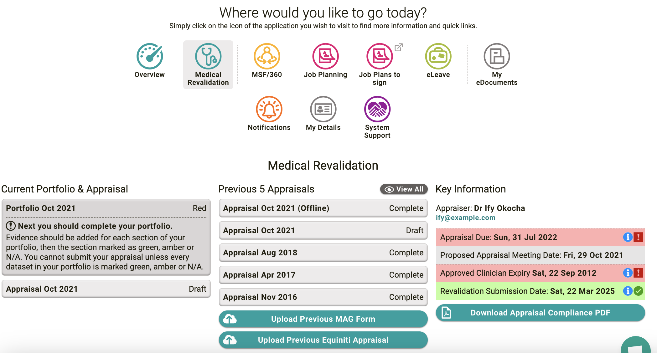
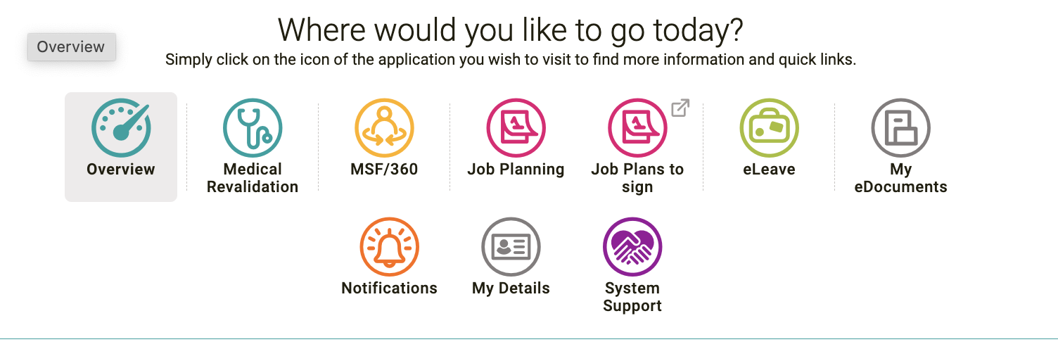
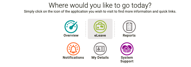
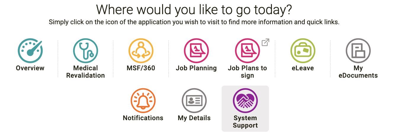
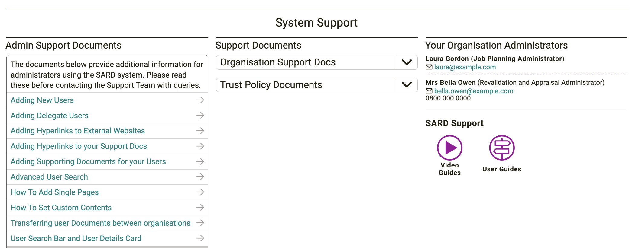
Note how the product icons remain at the top of each product selected, to ease navigation between products; the system support icon shows you all your support documents, and where to go if you need any help.
We are really excited about these changes, and hope you are too, if you have any feedback, please contact the support team on support@sardjv.co.uk
Appraisals and Job Plans
The team have been hard at work to improve the navigation of both Appraisals and Job Plans. The aim of this is to simplify navigation and ensure all important information is readily accessible on the forms as users work their way through the process. These changes will reduce the length of time it takes to complete the form and reduce queries about how to complete the forms. Please note that depending on the way your organisation uses the system it may look slightly different to the screenshots included e.g. section titles or numbers.
Appraisal form changes
You can now alternate between appraisal and portfolio using tabs at the top of the page, which is much clearer than the previous ‘Go to Portfolio’ button.
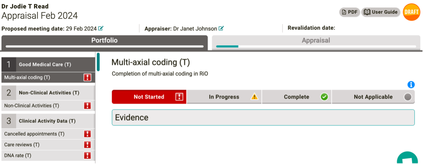
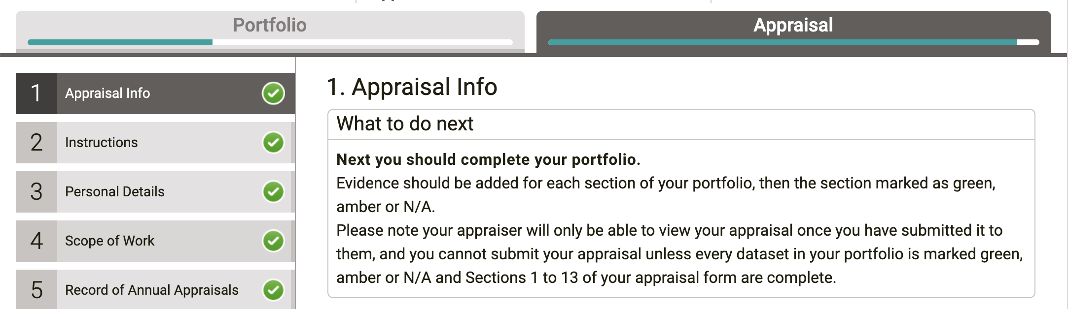
We have created progress a bar (within the tab buttons for Portfolio and Appraisal), to show a user where they are at with their relative forms. After consideration of different colours of state these remain one colour, and the bars fill up as progress is made on the two forms. This shows clarity of progress and once the bars are full, the appraisal can be submitted.
A ‘What to do next’ information box has been added in section one of the appraisal, which will inform users of what the next steps of their appraisal are.
Scrolling has also been improved; the side panel of sections now independently scrolls from the rest of the page, which makes it easier when trying to navigate to a new section. Just hover the mouse over the panel you would like to scroll (i.e. the current page on the right or the section list on the left) and scroll to find what you’re looking for or use the scrollers on the page.
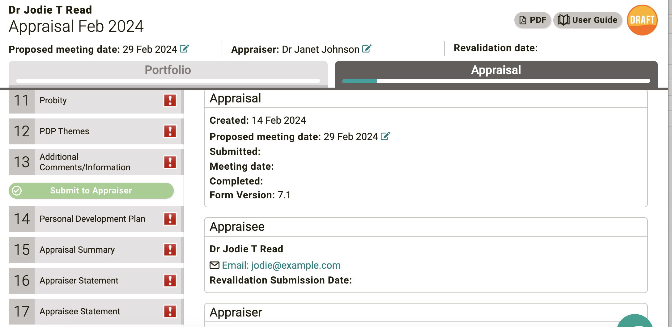
The ‘Submit’ button will now only be active to use once the user has completed all sections of both the appraisal and portfolio. Previously, a warning would pop up to explain what remained to be completed to submit.
Job Plan changes
All changes to navigation are for both Medical and AHP (Non-Medical) Job planning.
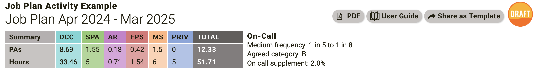
The Job Planning Activity Summary is now in a much clearer view across the top of the page and will remain visible regardless of which section the user is in. If a user does not have ATC or APA activity types, we have removed the respective check box in the new summary. If a user only has core there will be no tick box available as only core data will be shown.
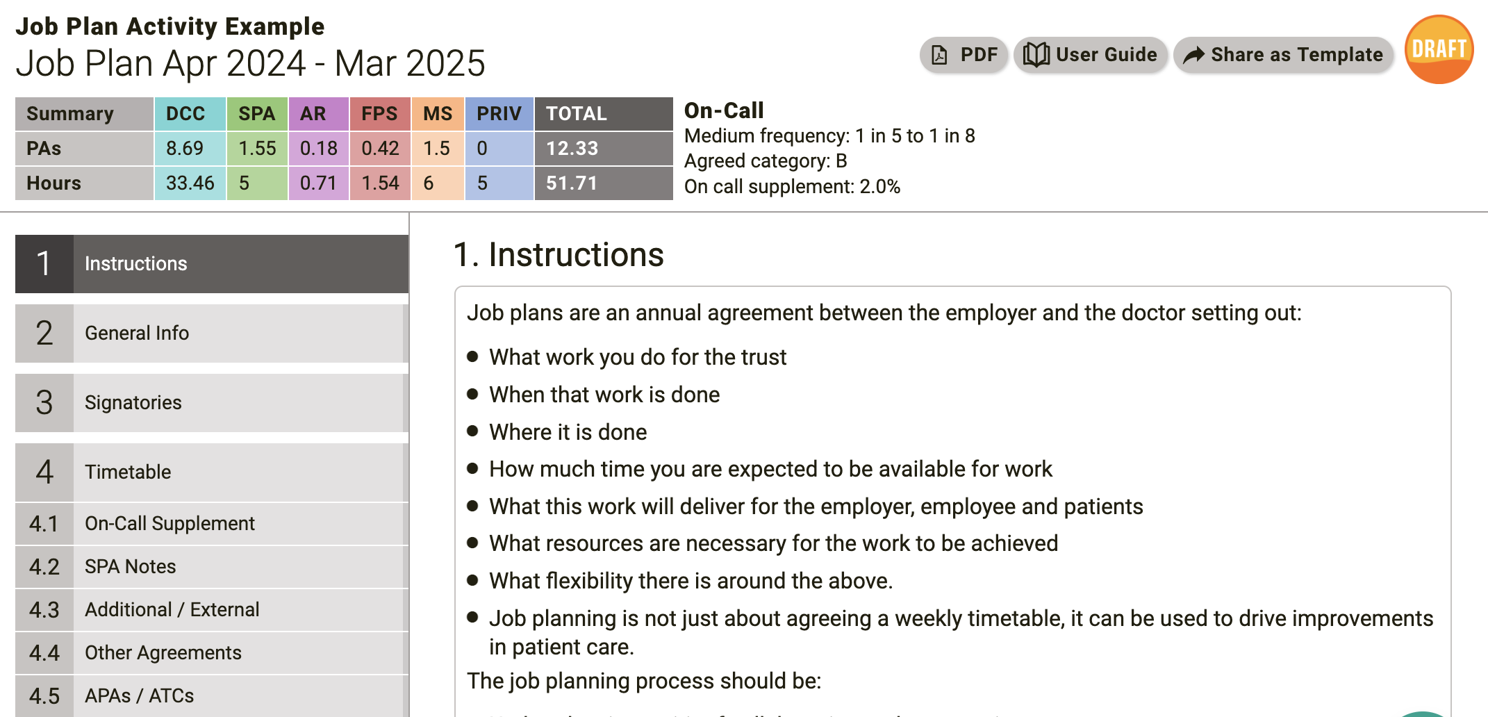
Scrolling has also been improved; the side panel of sections now independently scrolls from the rest of the page, which makes it easier when trying to navigate to a new section. Just hover the mouse over the panel you would like to scroll (i.e. the current page on the right or the section list on the left) and scroll to find what you’re looking for or use the scrollers on the page.
Best regards, The SARD Team