Improving Accessibility for Colour Blind Users
According to Colour Blind Awareness, colour blindness affects approximately 1 in 12 men (8.3%) and 1 in 200 women (0.5%). Following feedback from our users that are affected by this, we have redesigned the icons used throughout the site so they vary in shape as well as colour.
Here is how the portfolio section icons used to look to our users with various forms of colour blindness:
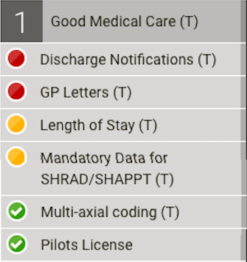 Normal Vision
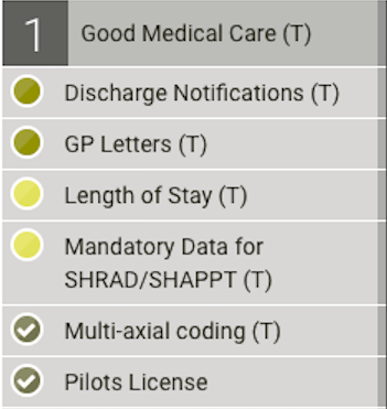 Protanopia
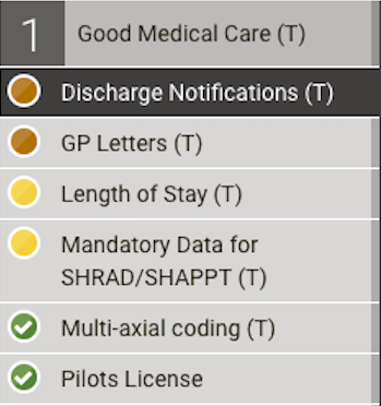 Protanomaly
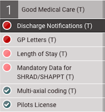 Tritanopia
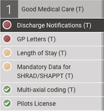 Achromatomaly
And this is how they look now:
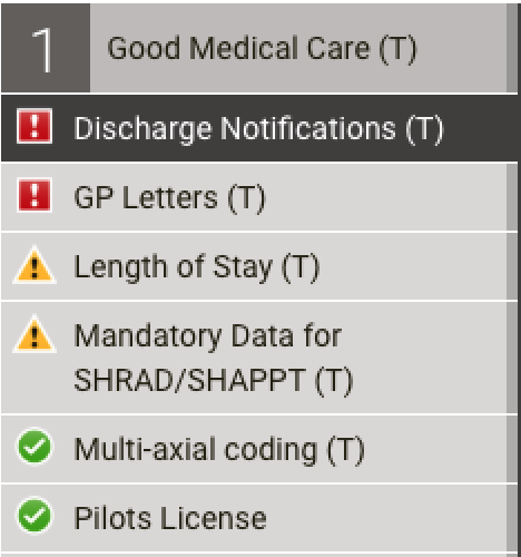 Normal Vision
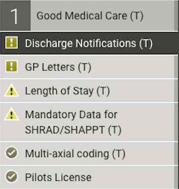 Protanopia
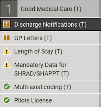 Protanomaly
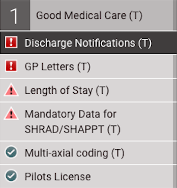 Tritanopia
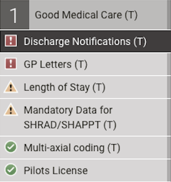 Achromatomaly
It’s not just the portfolio sections that have had their icons updated. We use icons throught the site to inidicate the state or compliance of documents such as appraisals, job plans and MSFs. The table below shows all of the differnt icons that are used:
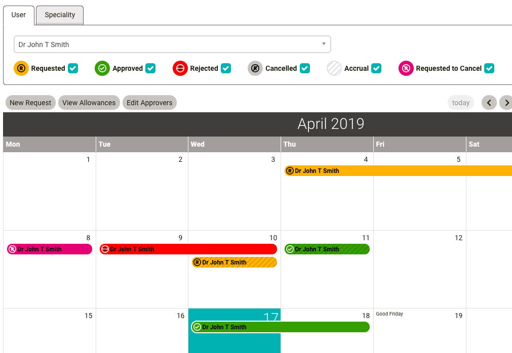
The eLeave calendar has also had a redesign, with icons being added to show the state of a leave request:
We are always looking to improve our site for all our users and welcome feedback on any accessibility issues.
